Menu & Navigation Redesign for Web App
My Role: Lead UI Design, Research, Information Architecture
The Product
PrimeLending’s Apply Now product helps its clients fill out a home loan application and also serves as a customer portal. Since it is the main source of new business and is often one of the first touch points in its customer’s journey it is important to give the user a great first impression.
App Users: Consumers applying for a mortgage loan residing in the United States
Main User Goal: Start a loan application for a mortgage
Additional User Goals: Track loan status, upload & download documents, and message loan officer
The Problem
The biggest problem with the old design was that it had two different menus and navigations leaving the user confused about where to go. The design solution was to combine all of the menus on one side of the screen allowing the user to easily see all of their options to click. The implementation of the new menu gave continuity to the web app having the look and functionality look similar across all different devices.
Main Project Goal: Redesign and consolidate the menu and navigation for easier use.
The Research
I researched various content management systems as well as web forms to see what layouts worked well. I ended up with a layout that has all the menu items on the left side and separating the form progress pages with the other menu items when the desktop version is displayed. The small and middle size screens were able to house all menu content leaving no questions for the user to have about where to go.
The Wireframes
Desktop Menu - Always Open
Tablet Menu - Menu Collapsed
Tablet Menu - Menu Opened
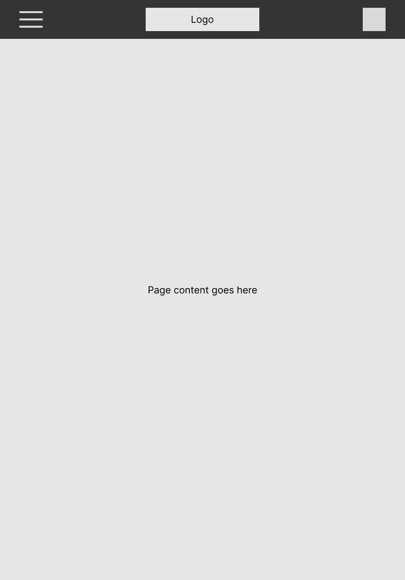
Mobile Menu - Menu Collapsed
Mobile Menu - Menu Opened
Old Double Menu
New Streamlined Menu
Old Menu Opened
New Streamlined Menu Opened
The Result
The result was a far more intuitive web app that left the users with a great first impression of the company. The feedback was overwhelmingly positive and our loan officers are proud to tell customers to go Apply Now.


